Expressionist Primitivism

African primitivism is a Western invention.

Germany was late among the European nations encountering and absorbing the meaning of dealing with more primitive peoples, those significantly less economically and culturally developed than they were, in that the primitive peoples were preliterate, even if, ironically, millennia before, as Tacitus attests, the Germans had been the barbarians who were confronted by the much more advanced Romans. The first invasion was the Spanish Conquest of South and Central America where Spain took gold from South and Central America and exported to that area its authoritarian religion and political administration. The English a century later extirpated the natives rather than turn them into peons so as to use the land for agriculture and so settled their own families into a group of English commonwealths even if they were chartered by an English king or nobleman. The French went farther afield, to Polynesia, exporting their language and culture and marveling, as Diderot did, at the freedoms these people had far from France, just as de Tocqueville, later on, thought was the case when contemplating the United States. More difficult to manage was Algeria, so close by and treated as a department of France, given that the Muslim world was not as far behind the Europeans in their culture and organization though, at the time, falling ever behind the Europeans in the clash of civilizations. The Germans, Johnny come latelies, only had a few puny colonies in Africa, but had become very conscious of primitive peoples. Germans romanticized American Indians in Karl May’s novels and in the Twentieth Century Germans filled their imagination with African people, as was clear in Expressionist art, and including up to the Sixties when Leni Riefenstahl did her unfinished documentary, The Black Cargo.

Double Portrait S. and L., Karl Schmidt-Rottluff, 1925, Museum Ostwall

A good way to begin in understanding the German take on African culture is to look at Karl Schmidt-Rottluff’s Double Portrait S. and L. from about 1925. The two figures are very different. One on the left has wide eyes and a reddish coloring uneven over the face which makes the nose mostly hidden in that color but outlined in green. While the figure on the right has narrow eyes and whose blue patches on the face also extend to the nose but so as to accentuate the nose because the blue is lighter and shaded with gray, it is possible to say that the two figures are portraits that are deliberately made ugly or that they evoke different moods, red for anger, perhaps, and blue associated with sadness. To say that is to speculate or read something in, like making a Beethoven symphony into a story, as people did in the late Nineteenth Century.

What can be accurately said is that the two faces are made into or clad with masks which might either hide or represent feeling, people elusive as they are present, a way of being faces different from a more traditional portrait that aims at accuracy and beauty both at the same time, as with Sargent, who had just died after his very long career. Here, instead, are disquieting and exaggerated presences so that the inner workings are elusive while the face, at least one of them, stare at the viewers in the face, each being what they inevitably are because they can be nothing other. The figures are not seen with x-ray vision or through interpretation or empathy but through how colors make people the ways they essentially are, and so it makes sense to think of masks, just as exist in African style because the mask also makes the person fierce or angry or just impressive because of its exaggerations and so the inner feeling is transmitted from the outside, from the appearances and, also is made rigid and guarded, as if the face could no longer be pliable or plastic but instead, like masks with which people cannot dispense. People of these sorts are rigid and the nature of color, a universal attribute, means they cannot be removed. Once seen, a face as a mask, never remembered. I do not have pleasure in seeing these faces but I appreciate them as existing in a kind of being which eludes their humanity while telling their harsh truths about how people can look and be looked at.

Three Nudes in the Forest, Otto Mueller, 1911

A more straightforward view of primitive Africans is presented by Otto Mueller who does many nudes of women in the forest, the bodies brown rather than black, as well as dual portraits of clothed African women. The style is clear in his Three Nudes in the Forest of 1911. The three, one seated, one standing full front, and the third to the side, are stylized in shape and color. Shadow and light are shown  by yellow tones, while most of the bodies are light brown. The features in the faces are sketchy, the breasts are small, and the vaginas are dark but not prominent. The forest is just a background of green foliage though you can see ferns and trees.The three figures are arranged so that the postures set one another off, as if they were exercises preparing for a portrait rather than the portrait itself. The painting can be compared to Picasso’s Les Demoiselles d'Avignon, near enough in time, from 1907, in that the figures are abstract and play against one another as if in a ballet pose. The objects are shapes rather than express meaning or personality or even sensuality, just their nudity. This is very far away from Renoir who tries to get the skin of his nudes just right so as to convey the beauty and sensuality of these women.

Two Sisters, Otto Mueller, undated

Mueller’s Two Sisters (undated) is very different even if it uses the same colors. The two girls have distinct faces, one with more open eyes than the other, but similar enough to show they are sisters. They are wearing modern dress even if rather unadorned and drab, in yellow and green, as is the green background. None of the brightness of color and elaborate dress found in Sargent, but poised, as suits, I would say, women acculturated to the West whatever their origins. Again, however, their busts are modest and their hair not highly dressed. The figures are distinct enough to make a viewer wonder what these people are like, which is remarkable enough in that these African figures are not just examples of a style, but individualized, and so like real people. Noteworthy, however, is that the trios and quartets of Africans, presumably because they are brown rather than just an arcane color, are put with indistinguishable backgrounds, brown or green and so suggesting foliage or sand but given little perspective and so like wallpaper, flat with a mood or design, and so very different where by Frederic Church, for example, the American artist half a century before, provides vistas so as to see foreign sites and flora and not just the abstracted people in their abstracted settings. The accomplishment of those expressionists make the shapes and the envelopment of setting as making the paintings about color and shape rather than factuality. Max Pechstein does present African natives in canoes just off a village but the anthropological and biological data is subsumed by the fanciful idea that the figures are nude when native peoples wore loincloths, just a fantasy of primitive life as au natural.

Early Morning, Max Pechstein, 1911

These new Expressionist conventions apply beyond the African scene. There is Max Pechstein’s Early Morning from 1911, which is a nude of a blue woman, something like from the movie Avatar, where blue is a natural color for a person, and has the usual sensuous and heavy lines even if her breasts are ample and oval rather than small and pointed and her stomach is large. Kirschner also does nudes in strange colors: whitish, or green, or many nude figures by other Expressionists in one or another brown to show, perhaps, that brown is a natural color for people.  

This leads to a new meaning for the primitive. It means elemental or basic, which in art means getting rid of fancy and civilized conventions like realism or perspective and getting back to the ways in which natives engaged in seeing before the civilized accouterments. In the pictures cited, that meant an emphasis on line and color and no distinction between foreground and background. Expressionists also engaged in presenting small patches of color that undid perspective by showing townscapes with a blur of glare infested places and so truer to experience than even the representations by Monet.

Red Houses, Erich Heckel, 1905

A good example of the Expressionist distinctive use of color is in Expressionist townscapes which avoid fidelity of representation to accomplish a fidelity of the way minds consider color. Erich Heckel’s Red Houses, from 1905, presents a number of houses next to one another which are each in a shade of red, those themselves not well matched but instead having their own qualities as well as adding up to a field of reddishness where the shade of red seems to go beyond the lines of the outline of the individual buildings so as to compass a reddish mass punctuated by blue blobs to indicate windows and all behind a field of dirty green. So this and other Expressionist art abandon the impressionist regularity of working within the lines as well as Whistler presenting swaths of black that emphasize the solidity and spatial dimensions of a bridge. Rather, what Heckel and others capture is a picture before it is straightened out by its conventions to become a representational one but are the experienced blotches not yet intellectually configured, primitive rather than abstract as if first seen before being attended to as a picture. The Expressionists try to imagine, like Kant, what experience is like before formed through the dimensions of time and space, and it is blobs of color.

A way to draw ideas about German Expressionism comes from looking at then contemporary American Negros who, after all, had to manage over the generations to overcome the cultural disparities that came from bringing people in a pre-literate culture forced into slavery and then into Emancipation and then into being part of the American mainstream. Alain Locke a philosopher and a student of the shifting Negro condition, said in The New Negro from 1925 that “African art is rigid, controlled, disciplined, abstract, [while] Afroamerican art is free, exuberant, emotional, sentimental, and humane”. Use these contrasting terms to describe Expressionist Primitivism. The authentically old was formalistic, distancing and scary while the Modernist take on Primitivism was fluid, with elongated rather than sharp shapes, colorful rather than monochromatic, and Romantic in its spirit of abandoning to the primitive rather than overcoming it with news gods and fiats. The plasticity of the self is a modern rather than a primitive invention and that is why, from Mary Shelley to Fritz Lang, it is about the future.

Expressionist Consciousness

Expressionism concerns the autonomy of consciousness and that issue runs deep in the German psyche.

Expressionism was a short lived art movement mostly in Germany in the three decades before, during, and after the First World War that included figures like Eric Nolde and Ernst Kirschner and Otto Dix though some art critics stretch the term to include some Picasso (who, after all, tried a bit of everything), El Greco’s “View of Toledo” (which was religiously inspired while Expressionists were not) and Vincent Van Gogh (who used bright colors and so was very different from Expressionists). The idea of Expressionism, critics generally agree, is that it was an attempt to externalize the feelings within people rather than to accurately portray what the external world looked like. That is true as far as it goes, but that does not explain how the actual features of the art convey the apparently other-worldly and cynical view of the scenes represented and what places them in the social context of Germany at that time. Go back to the elements employed in these paintings of Eric Ludwig Kirshner, the movement’s most central figure, to answer the question. 

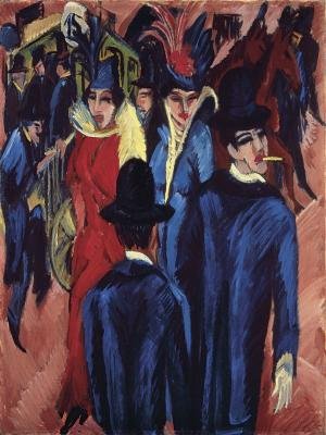
Here is Kirshner’s “Berlin Street Scene” from 1915, one of his many presentations of fancy ladies, some of them prostitutes, but not in this painting. These are sophisticated people. The look still predates the Flapper Age, with its short skirts and tiny bosoms, but the women are able to look classy, what with their well tailored dresses, both vividly red and blue, and with fancy hats. The women have shadowed eyes and pale faces while a man among them is smoking a cigarette, a sign of liberation from conventionality, as is the straightforward gazes of the women. Aesthetically pleasing and a bit different is that the red dress is to be contrasted with so many men and women dressed in blue, these accented with yellow highlights. What is the significance of this presentation?

Adopting Barrington Moore Jr.’s view that democracy proceeds from West to East and stymied by the remaining presence of a peasant class, industrialization also moved West to East and was more unsettling as it became ever more abrupt. English industrialization was home grown and developed in the Eighteenth Century when the steam engine allowed  for efficient coal mining and common people flocked to the cities to get jobs in the new industries. France did not make that transformation until Louis Philippe, the bourgeois king, and Russia did not industrialize until the Twentieth Century, while the change over in Germany, the marvel of it, was the generation before the First World War. Berlin was a young and adventurous city. The point about these sophisticated Berlin women was that Berlin had emerged rapidly in the last generation as a world class city replete with the most advanced Western culture and the latest trends and fashions accompanied with a subway and an electricity driven montage of lighted ads and internal combustion engine autos.

Look more deeply than to the audacious contemporary of  “Berlin Street Scene” by turning to Kirschner’s “Street, Dresden '' from 1906. Rather than the later sarcastic view of women primping and showing off in their pointed angularity, a comment about fashion and being fashionable, the earlier painting tries to get to the experience of what it is to meet people on the street. The essential quality of those people encountered is that they are fleshy rather than fleshed out. They are people caught in passing for a moment and so no more than dots of eyes on doughty faces, these distinguished by different skin shades even if we would all consider them white, some of them pale and some yellowish and some more red. The oval faces make them all somehow familiar even if they are strangers to others and by implication to themselves, people knowing others see us as strangers on the street.

It is also important to look at the color of the dresses in “Street, Dresden”. As with skin tone, the painting is more realistic than an Impressionist point of view might imagine them to be. One woman wears a striking yellow jacket over her blue skirt. The dress is partly continued by the yellow theme in another part of the painting but that does not dissuade the viewer from seeing the color scheme as disjointed and a bit ugly, perhaps because the jacket is not quite pure yellow, the dress admixed to make it a bit off. The dresses of the adjoining women have red dresses that are also not primary and somehow clash with the other dresses. This seems realistic rather than as is usually thought as the imposition by Expressionists by strange and clashing colors because, in fact, people do not wear their clothes to coordinate with the people they will meet. The actual scene is of whatever collection of colors is a happenstance and so a jumble.

The colors used in Kirshner and other Expressionists  is akin to what happens in architecture. Yes, there were planned residences in Berlin at the time just as the design for the apartments in Bath, England had been designed to provide a unified presentation of an oval of similar heighted houses. That provided a very pleasing environment. The same thing happened when the Lincoln Center area in New York was razed so as to build a set of coordinated buildings, much to the chagrin of those who preferred the helter skelter version of Times Square as an entertainment venue. Most of the time, most architectural places are also a jumble of buildings from different periods and contrasting styles, disproportionate in scale and in a variety of styles tight next to one another and buildings in various states of repair. The same is true of people on the street. The actual scene is of whatever collection of colors is a happenstance and so a jumble.

Compare the color schemes of Impressionism against which the Expressionists were answering. Impressionist painters presented a number of distinct and fresh colors into their paletes and were able to combine different colors on the same painting as well as make some of the paintings monochromatic. But the Impressionists maintained a uniform and well integrated set of colors in any particular painting and so it can be said that part of the Impressionist mode was to maintain a pleasing and integrating point of view on color so that the color scheme of a painting was independent of its subject. It is therefore fair to say that Impressionist color was a conventionalized idea of culture that, in fact, is true in most of the history of painting. Expressionism, for its part, is thought to have applied conventionalism to color in its preferences for dark colors and the use of green and red even on faces. But the Expressionists were a breakthrough in that there was no longer a need to make the colors uniform but, to the contrary, discordant with one another, answering to how reality itself was a jumble of colors that did not match in some sense with one another. That revolution in color is one of the things that might make Expressionism unsettling and even temporary as a movement because it was so wedded to its limited and strange color range. But that is to forget that Rembrandt and Turner were themselves, each on their own, also wedded with their own color schemes which are acceptable because they are their signature tones and so the ways they each saw the world.

Here is a Kirchner landscape, “The Red Tower in Halle'', that reveals Kirshner’s ways for doing a landscape. The title is itself curious in that the color of the painting as a whole is blue and the tower, not named as a church though it has the steepled shape of one, and is largely black, although the viewer notes, as an afterthought, that the bottom stories of the central structure is not red either but a kind of orange, that color wandering across the painting through the depiction of an orange train atop an orange embankment, which suggests just how large and majestic the structure is. Otherwise, there are shades of blue to color the area surrounding the tower and also white clouds behind. There is what might be a large plaza around the tower, residential or commercial buildings considerably distant from the tower, but there is no hard evidence for the plaza except its existence as an expanse of space  in that there are no indications of the cafes or the statutes that might be present in a plaza that surrounds a significant structure. There are no people depicted though they are presumed to exist in that there is a trolley tram traversing the area. The tower seems like a force field repelling away any other structures around it so as to expand that undescribed space, and so suggests that the mind observes that a space worthy of the tower has to be pushed away so as to allow the tower its stature. Architects make what minds need. 

What is to be made of a landscape divested of its accouterments? “The Red Tower in Halle” can be understood as getting down to essentials by eliminating detail. It just shows blocks of figures, the buildings behind, the spaces around the tower, and the tower itself, experienced as enormous in its setting, towering over the area. That is what is important about the scene: its relative sizes and clearances and the overall blue and darkened hue as if the eye had squinted to see what was really there. That is what it is like to have a feel for a place as opposed to when you see the cafes on the Champs Elysee. Notice how shocking is the contrast to Monet on Rheims, where the details of the stone are reflected differently in different parts of a day’s sunlight. Rather than charmed by the light, the sight is imposing with its gloomy grandeur because of its raw comparative sizes. It is not a stretch to say that Kirshner is onto a phenomenological perspective: to perceive perception as elemental experiences fundamental to the ways of the mind even if people can only with difficulty are able to become aware of what the way their minds work, in this case through blocks father than things and spaces rather than people. This is a new vision not quite lost once seen, while Impressionism, as I have said, remains faithful to its real world surroundings and its details and its color harmony, an artistic addition to the world rather than what an essential mind would garner.

Expressionist painting, even if partly a portrayal of what was fashionable and an artistic movement only temporarily in style, was primarily concerned with consciousness. Even pre-Flapper dress and faces evoked the emotional tones at the core of these people: daring in dress and manner so as to show their independence.  People are like autos in that they have so many styles and colors, each one is perceived by the pedestrian as each to display a type. Each is a kind of personality, as happens when seeing distinct people on the street, each one a type of itself, somehow assembling its own dress and posture and expression. What they are is what counts. That is also true about the structures of consciousness itself. Places seem to bend as shapes are fitted to be placed into the ways the mind will allow them to be organized. Painting therefore illuminates what is invisible and difficult to appreciate by objectifying the ways the mind works.

The conventional and to my mind correct explanation for the depthlessness, the profundity, of German art, literature and thought is that they are all derived from Luther’s perception that religion is found as mediated through consciousness, in that the consciousness is altered by religion rather than that supernatural events intrude in life and people do rituals so as to alter events, which is the case in Catholicism. Kant is the most significant of the German achievements in reducing into secular terms the idea of duty and free will and logical thinking itself as the way consciousness works. Expressionism is a recent version of the attempt to show that to see something is to unfold the way consciousness works, the world perceived from the building blocks of consciousness. That view seems to me, as I say, very deep, even if I think David Hume and G. E. Moore are more accurate in describing the way emotions, social life and ethics work. 

It is a mistake, however, to think that German thought would inevitably descend into Hitler, which is what Erich Fromm thought in his “Escape From Freedom'' because that is to look only at one aspect of the Luther heritage. Expressionists, like Heidigger and his student Sartre, are concerned with the experiences of being rather than how to enter a cul de sac where freedom comes from paradoxically denying it. Rather, the contours of consciousness are inexhaustible in themselves. Were it not for a few mistakes, such as Breuning thinking he could control Hitler, the whole Hitler episode would never have happened and Expressionism could have lingered for much longer and to rival the Abstract Expressionism that claimed American artistic  taste. Remember that Ernest Lubitch, Fritz Lang and Billy Wilder did well in the United States, maintaining their senses of cosmopolitan cynicism, although bereft of their color, while Thomas Mann “colors” and plumage are vibrant and dark in “Joseph and His Brothers”, even if it was written when he was briefly resident in Los Angeles.


Kinds of Art

Renée Jeanne Falconetti in La Passion de Jeanne d'Arc, Carl Dreyer, 1928

Here is a fresh way of dividing up the visual arts as objects that are appreciated for their things, whether in painting or sculpture; experiences, as the emotions and ideas generated from the visual object, as is clear in Abstract Expressionism; and images, which are what  are in the mind of what has been produced, like the face of the actress, Falconetti, in Dreyer’s film, “Joan of Arc”. This division can be considered metaphysical because they refer to three kinds of being, but they are actual , however abstract, because they name and refer to actual properties that exist in the world and compared to one another rather than indivisible and inevitable such as real metaphysical properties like free will or cause.This division is different from the usual ways of  classifying visual arts. The most common one is historical. Textbooks of art history divide periods from Egyptian to classical to Christian to secular and then to modern, Impressionism a bridge to the preoccupation with what the artist interprets the painting to be, and then on Asian and pre-literate art, those added to new wings in museums, and then to contemporary art, the latest additions made distinct even if of shorter duration because they are more known to the contemporary consciousness.  That telescoping of more recent history also applies to what is apparently the non-historical division of another principle for dividing the visual arts, which is by their media. There is painting and sculpture and architecture and also recently textiles, whether quilting or courtourie, and also cinema, even though people wonder about its cross with storytelling, some art aficionados are more concerned with the visual quality of films than of their narratives. Everybody argues about the edges rather than the essences.

One of the most accessible forms of art available to children is the room of armor found in the Metropolitan Museum of Art in New York. The armor is different from other things because of its time and the shapes. These objects are designed to protect combatants while being flexible enough to allow some mobility and so the various parts are designed to work together smoothly. Clearly, armor is rightly understood as an object that is artful as well as artistic  because it conveys warfare in a previous age even if I was not particularly taken with it when I was young because more representational art engaged me. Another object that did engage my younger interest was the gate in the Spanish room (where the Christmas tree sands) that showed the appeal of Spanish culture, what were its gentle curves and overall majesty. Those are clearly things that also express mood and meaning\, which are the hallmarks of art.

If you think about it, representational art, the reproduction of lives and landscapes and still pictures seen within the frame surrounding the canvas on which it has been painted, are also things. Otherwise, we could not very well understand at what we are looking at; a portrait of life rather than life itself, three dimensions turned into two, making use of paint so as to create its effects, the parts of the picture arranged in a composition so that it cuts off the sce at its four ends, a kind of balance between those elements, the artist choosing which colors and objects to provide mood and meaning, so that the viewer is prompted to ‘read” the painting. “A window in the world” indeed, though also seen as the limitations imposed by the artist, as when a poet decides to form his words into a particular rhyme scheme. A canvas is always asking what a painter will fill out of the nothingness and for ages it is to copy what is to be seen in the world because capturing that seems worthwhile, previously even to when words were able to capture what it was they came to represent.

Leonardo da Vinci’s unfinished St. Jerome in the Wilderness, 1480 - 1490

A good way to understand painting as a thing made within the constraint of a flat rectangle is to look at some of the various versions of St. Jerome in the wilderness that were painted in the late fifteenth century. They show them to be varied enough to invoke interest in the distinctiveness of the painters as they make their art while still confined to standardized techniques and ideas. Leonardo da Vinci’s unfinished “St. Jerome in the Wilderness”, composed between 1480 and 1490, segments the parts of the picture. In the center is the molding of the face, deep into the subject being distracted or perhaps internal, a kind of suffering, faces always da Vinci’s long suit. The background gives a sense of distance, a characteristic motif of the period, while the lion stretched out in front of St. Jerome shows his back, especially the long tail elongating the lion’s spine. A speculation or recreation imagines that the space in the upper right would show a picture of Christ on the Cross, which makes sense becau8sethat image is presented in Cima de Congliano’s “St Jerome in the Wilderness” from about 1500-1505

The thing about da Vici’s version is that it is fragmented into its parts on the canvas, each area having its own subject and presentation, some fresh (the lion and the face) but some conventional (the background). Da Vinci is, of course, capable of integrating the parts into a single whole, as he does in the Last Supper, where the ensemble of faces makes each of them distinct even though the effect is to see them as a whole, never as successful as being a painting that is a single composition as well as an assemblage of one until Rembrandt. What the da Vinci painting shows is that the parts of a painting work simultaneously, the viewer shifting back and forth between the various parts of it and so seeing the painting as related in that simultaneous way, as that is opposed to a story, where a novel is separated by chapters as the reader proceeds sequentially and so supposing time intervenes and so causes events while that is not necessary in painting, where everything is going on at once. The story of the lion, and the legend attached to it, is next to the perhaps spiritual or mental image of Christ and the setting amid the mountains.

The Conegliano St. Jerome is better integrated but it also is assembled within the frame from its parts. On the right is a blue hued painting of St. Jerome praying to Christ on the cross, which is to the left, and is  a tall vertical line, while the mountains in the background are in the center and a set of stones indicating a cave is on the right but is cut off by the frame, the end of the canvas, which suggests that the viewer need not see the cave, only the suggestion of it, while the stones in front of it are given in detail, suggesting the ruggedness but also the artfulness of depicting stones. What ties the segments together is the storyline about a prayerful person pursuing his ascetic devotions but also the blue water in the center behind the rocks tied in with the other blue parts. So color and cropping allow a way to fashion various images into a whole. There is a need to do something about integration in a picture.

Cima da Conegliana, St. Jerome in the Wilderness, c. 1495

Albrecht Dürer, St. Jerome in the Wilderness, c. 1496

Albrecht Durer who did a St. Jerome in the Wilderness in 1496 did not use color to tie together the parts on his canvas. He restricted himself to thick and thin lines on the picture. There are vertically composed mountains on the left and the figure of St. Jerome in the center while the lion is beside him to the right. What provides a pleasing formation is the comparison between verticals and horizontals and added on is a diagonal whereby a path away from the right indicates the obligatory rendition of distance. This is a very abstract configuration that contemporary critics would find familiar but I assume that early modern painters and draftsmen also understood, all in the inevitable service of tying the elements of a painting or drawing into a unity, an element of art at least as important as the unities of time and space were essential to Aristotle’s conception of drama.

A second kind of art has to do with experience, which means that art consists of the emotional experience that is engendered by artistic presentations which somehow corresponds to the real and imaginary worlds from which the experience is drawn and distorted. It takes a moment to unpack what is meant by “experience”, that best understood in John Dewey’s “Art As Experience”. In the later parts of the Nineteenth Century, psychologists used the relationship between stimulus and response as a way to show cause and effect in people. If a flame approached your hand, you went ouch. There is a direct implication of one external event to a person’s sensation. But by the beginning of the Twentieth Century, Pragmatists abandoned that point of view, even if Skinner would later on clearly retain that framework. William Janes in “The Varieties of Religious Experience’ was interested in elaborating the consciousness of a believer as, for example, “once” or “second” born rather than what were the roots that led people to become religious in the first place. That is also true of other complex states of consciousness, as is the case in art and literature, and literary and art critics knew that. You could look at the picture or you could look at the emotional or intellectual response and it didn’t matter because it amounted to the same thing because what you earned and your failure to read the picture or novel properly was the result of failed attentiveness from in the response was what had been in the painting or the book as rather than the inevitability of its message coming through, the reader or audience the equivalent of being color blond or maybe lived for so long in a cave that they could not get the interactions between people that were involved in dialogue. Or, to look at the object rather than the response, maybe the author had not displayed dialogue well enough so that the irony of how Emma was clueless was insufficiently spelled out, though, of course, Jane Austen had done that over and over again.

Green and Tangerine on Red, Mark Rothko, 1956

An experience, therefore, is neither a cause nor an effect but is a representation of something in the world or in the imagination (for what could it otherwise be?) as that is crafted so as to convey its distinctive nature, a representation having all the ambiguities of how it is like and unlike its object, such as the extent is objective (as if copied from nature by an artist like Church, or subjective, as when Picasso represents in “Guernica” the anguish and pain of wartime, or the difference between the real in the sense of visually accurate, on the one hand, or the unreal, which is fantastic, as in Surrealism, where figures are somewhat but not quite accurate representations. A good example of representation is found in Rothko’s Abstract Expressionism which some people will say is about nothing but has simply abstracted out of portraits and landscapes the colors and shapes, those laid bear for themselves alone, even if artists have always known that embedded in their portraits were lines, shapes and color. But take another turn. What is happening is that the shapes and color are themselves subject matters, explored for their own sakes, and so Rothko in, for example, his 1956 “Green and Tangerine” provides elemental patches, as the philosophers would say to refer to an impression not yet formed into colors,  of the two colors that are surprising in each of their qualities and juxtapositions, also requiring attendance by Rothko to the multiple decisions he made: just how large the painting would be; how thick is the paint itself, what creates an unexpected juxtaposition of shades of or different colors, and so on, the colors and shades in realistic portraiture designed to provide meaning to a representation, the figure good or bad or in turmoil, while the colors in a Rothko just reveal themselves and so are thought to be meaningless rather than about themselves A view of a Rothko is liberated to think of the scheme for itself rather than as a realistic portrait or landscape, enjoying being outside the everyday which usually encloses our lives. 

It is curious that getting back to the elemental seems liberating because a portrait has been shed of its appearances, of what we see in everyday life, as if we had a new kind of x-ray vision that can shed a scene of its figures and meanings, but the same is knot the case with the case of sound, a less powerful taste than sight, because elemental forces of sound, like the repetitive sounding of drums  seem confining and deadening rather than liberating,the aesthetic experience of sound coming to be liberated into the religious terms for being “ethereal” or “sublime” because of pianos and violins and clarinets. The other senses of touch and smell create no art at al even if they are pleasant  and even taste,let me be forgiven by the great chefs, also does not convey much meaning, despite Levi-Straus’ attempt to explain otherwise, and story requiring not a sense but mind itself to allow there to be a bridge across time so that cause can be said to precede effect. In short, art is valued as the main  candidate of experience for itself rather than the facts, either of color or shape or face that art can reveal, which it did when Holbein made portraits so that Henry VIII could find out what these real people looked like. Experience is a very different standard to use for art than is the object itself, previously referred to as the art of making a thing into a thing through the organization of its parts. 

The Syndics of the Drapers’ Guild, Rembrandt, 1662

There is a third kind of entity that constitutes art. It is neither the object in the world that has been fashioned as art, nor is it the experience of having labeled a picture as an aesthetic object and so see the meanings and emotions evoked by treating it as art. Rather, it is the image in itself that is taken from the art object so that it is no different from thee multiple views a person sees as he or she walks up a street without thinking of them as a succession of snapshots framed as stills, but just what it is that is notices every so slightly altered as you walk forwards. It is art without thinking of it as art.But it is very difficult to eliminate the frame if one at all notices that a view is striking. Think of Rembrandt’s “The Syndics”, which might as well have been a posed photograph, akin to those taken through photography with an assemblage of the Supreme Court or a baseball team. The syndics are also looking forward to the photographer or the artist; they are also wearing their similar, collective costume; they are poised for the moment before going on with their businesses. Try to forget that and go at the image itself which can reveal information and emotion about that assemblage. Each of the syndics (or the baseball players) have distinct faces even if they are all serious minded. They show themselves as indicating a common purpose because of their dress, eve if the clothing in the syndics is of appropriate business attire rather than a uniform; and they are pausing in their efforts because it is important that they be assembled and recognized as such, and in that last observation or recognition are jumping back into being within a frame.  

Yet somehow viewers separate the image from its frame or its being as art and look to the substance rather than the composition or the other filters through which the image is understood. We look at “Guernica” to see atrocities rather than a suffering bull as its central image; we see the immodesty of a naked woman at a picnic luncheon rather than about how fantasy and reality are superimposed by an artist; we see Leonardo’s face in St Jerome as poignant and deep and not just an icon of spirituality.A good way of unleashing an image from its artistry is in photographs. Sure, many of them are composed, even when the photographs were made in wartime. While Civil War photographs may have been composed, the point was to get information about what the devastation looked like, how people were quartered, and how Grant was seen as surrounded by his generals, the point of the last of them that there seemed to be a lot of generals to conduct a war. The viewer saw that. Yes, the raising of the flag in Mt. Suribachi on Iwo Jimi was rigged and came across as aesthetic and emblematic, but there are so many other war photos which are less concerned with composition than getting the facts: what it looked like and not just heard on the radio what FDR said to Congress during his Dec. 8th, 1941 Day of Infamy Speech. You had to be there. Similarly, there are loads of footage of the attack on Congress on Jan. 6, 2020 and very few, if any, were well composed. The footage recorded what happened, was a record, rather than a work of art.

Dorothea Lange, Migrant Mother, Nipomo, California, March 1936

Not only war or political images can emerge out of art into being something aside from art. Any image can reverberate on its own out of the available images loaded from life and, indeed, made use of by artists aside from their compositions as what convey meaning and emotion. The child in any crib, pondered by any parent, can be appropriated as the Christ child and added on any number of meanings. Anyone walking down the street can see how buildings superimpose themselves with other buildings and so create complicated spaces with horizontals, verticals and diagonals quite aside from the fact that those relations are also explored by artists given to cityscapes. The artist then is to capture a particular available image in a way so that it is more striking, as when Dorothea Lange captured Okie women moving West.

Remington's Wild West

The art developed concerning the Wild West during the period when it was preoccupied with cowboys and indians was akin to what happened at a similar time when Impressionist Paris was preoccupied with gardens and boulevards.The same scenes in each of those movements were done over and over as if doing it again would accomplish a meaning not previously achieved but somehow still elusive. It is very different in structure and meaning from the art crafted in the East and West coasts of the United States and in its Mountain states, not least that the art not about the Wild West seems definitive in that each of the related paintings are complete. Durants’ landscapes are about hills and trees and rocks but each one is assembled into a different arrangement, a different balance of its elements,while Remington’s are repetition in that they just replicate whatever motif of the Wild West that he has identified. Once you know the type, that is all there is, while each Monet is different. It is not a compliment to say that Remington is akin to Andy Warhol in being engaged in an age of reproduction where multiplication is an appeal to the market rather than to have a subtly different perspective on the same themes. Past art was to sell each portrait or landscape as a distinctive gem while reproducible art is to remind the viewer that the atifact is an example of a type.

Read More

Accessible Art in Chicago

I had an art Trifecta when I visited Chicago last week. I saw a comprehensive Cezanne exhibit at the Chicago Art Institute, its premiere museum. I saw at the Museum of Contemporary Art, a museum that often disappoints, a large show of installations and sculptures of Nick Cave, an artist coming into prominence, and I saw in a hole-in-the- wall gallery in a developing neighborhood, an artist that I had never heard of. What they all had in common was the accessibility of the art. The friend I was with said you could take a pre-teen to the Cave show and the child would get its intricate hangings and the monumental outre statues, knowing some to be a joke and others just dazzling, but wondered whether the visitors would get Cezanne, and I thought so, even if Cezanne is known as a great artist and people might see the show just so as to say they were there.

Read More

New Yorker Covers and Culture

Some years ago, my friend, the critic of culture Roland Wulbert, remarked that “New Yorker” covers contained only one joke. I did not know whether this observation was a convention unessential to the genre of the magazine’s cover or whether it was an essential point so that this form of understanding could not be the same thing if it were to include multiple jokes. I have been intrigued with this insight ever since. I want to get right what magazine covers are as forms of expression and what they tell about the message to be conveyed or about the temper of the times, cultural critics looking at the nuances of one or another aspect of culture so as to grasp the nature of reality, of existential life, or else the social ambiance of a time, for those items of culture reveal far more to me, at least, than what is told by survey research or by the not so deep thinkers who opine over the airways.

Read More

Clutter in Art and Reality

All around us is clutter, these objects right at hand because they are functional in that you may need any one of them to help move along the day, but items thought so insignificant unless they are misplaced that you forget how important they are and so we dismiss them as clutter, whether a person surrounded by clutter is the kind of person who organizes the mess or lets it find itself, a person knowing where to reach to find it in its disorganization, such as a book not catalogued, or a hand lotion on the bathroom sink rather than in a medicine chest. Some of the clutter places its historical provenance while others do not. Women had sachets because people smelled bad, but there are still perfumes and room deodorants. But paper clips seem to me to have been of a time in that people needed to clip together single sheets of paper when those could be separated or mislaid, while today you just print off another copy of numerous pages from your computer and the printer staples the copies. Think of all these objects as a museum that offers time and place and general functions and so an entry into life, akin to the artists that make collages of objects atop one another so as to provide the mood of a person or a place. I have in mind Picasso and Braque and let us learn something from them before turning to the clutter of real life.

Read More

The Top of the World

Heading west on Interstate 84 in eastern Oregon, the route passes through the Rockies in an unusual way. Rather than trails and roads finding their way through passes between the mountains so as to see the valleys between, which is what happens later on in our route to Seattle, when the lush valleys can be seen suddenly uncovered in their sunshine and shadows, idyllic places rather than the rough places of the peaks that are higher by far than where the roads go through it, Interstate 84 instead finds its way on top of the mountains, moving from high point to high point, these not apexes but extended ridges where the trees to both sides are of the same elevation as the road, no cliffs to see, nor the valleys either, because the trees are enough to prevent looking at a gap or offering a clearing. The result is that the passing cars offer a sense of being on top of the world, a continuous thing that goes for a long distance and so making the whole vistaless view seem miraculous, a deep insight into how there is nothing higher but nothing depressed and so offering a very little angle of vision. This experience is remarkably pleasurable partly because it is so unusual a vantage point, or rather the lack of a vantage point, and even more so because the whole scene seems to float without a top and a bottom, as if there were a natural equality in which people (or trees) were embedded, rather than a natural inequality whereby something is always either higher or lower, these the differences in geometry about something very fundamental about social life, which is that equality and inequality are the two natural states of social existence with inequality the predominant quality. We all float amidst the unusual sight of the equal society of trees surrounding one another and those who observe them rather than some more elevated than others, looking at other companion trees rather than in the distance. Isn't equality grand?

Read More

The Expanse of Landscapes

The essence of the visual arts is to show what things look like. The visual arts can also offer designs or illustrations of ideas, but those are not the main thing. Picasso’s “Guernica” shows the anguish of a gored bull and viewers read about it to learn that the painting was about the Spanish Civil War. The commentary, not the picture, told the viewer that. Lenze’s “Crossing of the Delaware” commemorates an important event in American history and so convey’s patriotism, but what the viewer sees is all these people jumbled together in a boat and wondering whether the boat will capsize. More important as for the aesthetics of the visual arts is that each of the major genres of the visual arts find the particular subject matter whereby what is to be shown. Still lifes show arrangements of articles so that the juxtaposition is quaint of vases and fruit or even rotten fruit so as to gather the experience of having all of those experiences put together for their textures or shapes or the different kinds of those things, some ceramic, some organic, some sleek, some mottled. Portraits, for another example of the genres of the visual arts, show faces for whatever it means for people to interpret what is to be made of faces, how faces reveal or cover up minds. You may look at Rembrandt’s “ The Syndics of the Drapers’ Guild” as a presentation of how important people are meeting with one another, and so a record or a commemoration of that event, but the primary thing to notice is the faces, what particular people look like and how they are different and the same as people’s other faces.

Read More

A Bit of Decoration

When Andy Warhol in the Sixties started making his silkscreens of Marilyn Monroe and Mao Tse Tung, he changed what art had been for twenty five hundred years or so and did something very different and not for the better. Previously, art had been a window into life, a depiction of scenes and arrangement and color that conveyed meaning and emotion, within a frame even if there was no frame and even if very large, as was still true in the Abstract Expressionism of the Fifties. Instead, the difference of one object to the other of his silkscreens were colors that added nothing to the emotion or meaning, instead only providing a differentiation that could allow even the multiple copies of one of the images differentiated enough to be peddled as being something different. Nothing changed after that revolution in that art has dry ironies but little emotion or arrangement, one exception being the quartet of women whose photo was taken every year and so allow how these distinct but familially related people age over time, true to the oldest instinct of portraiture, which is to see what is the person behind the face. I want to look at some of the holdings in the contemporary wing of the Chicago Art Institute to see whether I can reap something of value for my pre Warhol aesthetics.

Read More

Ordinary Painting

Here are three oil paintings in the European representational tradition that have found their ways to the Utah Museum of Fine Arts in Salt Lake City. They are not particularly good paintings and they are worth thinking about so as to help understand why oil painting in its representational mode is such a satisfying experience, ones that give pleasure not because the artist is clever or insightful or with superb technique, but because painting itself in these of its genres has a power of its own. These paintings can be best appreciated for what it is to be paintings.

Read More

Monuments

Some places that are destination points also do other things. A person can visit the Empire State Building to look at the little ants on the street that they view from near the top, or they can, while on street level, look up to the not quite sheer towers that are above, there being setbacks from the broader base of the lower floors. That is majesty and artistry occurring while floors and offices are rented and occupied within the floors. A tourist has the same experience when visiting St. Patrick’s Cathedral so as to see the spaces of the church during which a major or minor service is also taking place. You can look at the architecture of the George Washington Bridge while also watching the automobiles travel over the most heavily traveled bridge in the world. On the other hand, there are destination points that are only to be looked at. There is nothing else to do with them other than allow people to observe and tramp through them, which is the case with the national parks that I visited in the past few weeks in southern Utah, when my son and grandson and I visited Zion National Park, Bryce Canyon, Arches National Park and Canyonlands, the Park Service having very artistically arranged for visitor centers to look on imposing edifices and also to create roadways that allowed access for astonishing sites to see. But the cliffs and canyons and rock formations were not meant to do anything but look, to be turned only into aesthetic objects, because nothing else could be done with that harsh terrain. You couldn’t farm or easily build houses in such remote terrain and there are or were no ores. There were just places to see and so it is worth thinking about what are the aesthetics to be drawn from people who are forced to consider something aesthetic because there is nothing else to do with them, as well as to consider these objects by people who, like myself, claim to have a disciplined take on the aesthetic.

Read More

Sara Rossberg

Sara Rossberg is a British portraitist who flourished during the 1990’s though she has done later work through the present, and now works primarily with color and texture to distort the faces of people. His most accomplished work is included in London’s National Gallery. Entitled “Dame Anita Roddick'' and painted in 1995, it is a striking and depth filled presentation of its subject. The woman’s face is framed by her frazzled red hair, her face also with a tint of red. Her lips are thin, as are her eyebrows. Her facial expression is intense and soulful, livened by her anxiety or mournfulness, particularly (and inevitably) projected in her pained eyes. A nice touch is that Dame Anita’s blouse peters off into being of no consequence while her hair had very much caught the face that would come below it. So Rossberg provides an internal soul made very visible, when Sargent, the master portraitist of a century ago, has the audience draw out of their regal and polished presentations each of their fully human and individual consciousnesses. The Rossberg painting shows people not disassembled but in their inner thoughts, looking composed in their everyday lives and yet still penetrating. A worthy addition to the collection.

Read More

Bruegel's Secularism

The Lowlands, or Lotharingia, as Henri Pirenne insisted on calling it, because it was a distinct cultural place that for a variety of reasons never became a great nation on its own the way France and Germany did, was nevertheless a central place for the creation of European history because it was the meeting place of the Roman and the Germanic cultures, never mind that John Motley, in his Nineteenth Century nationalist way, thought the distinctiveness of the Lowlands could be attributed to a native people living in a swampland that made them both ingenious and cooperative.

The Lowlands was the setting for a world empire that for a while rivaled those of Spain and England. It produced unsurpassed art and some of the most important scientific breakthroughs: the invention of the microscope and the discovery of the cell. Though the Lowlands never created a great vernacular literature, their literary and philosophical accomplishments are marked by Erasmus, Spinoza and Grotius, all of whom wrote in Latin. But most important, the Lowlands is where both political and philosophical liberalism began.

Read More

The Liturgy in "Revelations"

The older way to read the Bible is to take the text apart and show the various sources from which it was compiled. The Anchor Bible of the Seventies represented a kind of final step in what was known as the Higher Criticism. The editor of its edition of “The Book of Revelations” suggests that the material in the book comes largely from Jewish apocalypses although some other material is added on. That tells you that what separates “Revelations” from the rest of the New Testament is its ties to “Ezekiel”. It is not tied to the non-apocalyptic tone which pervades most of the Gospels, at least if you conceive Jesus and his followers, a few remarks to the contrary, to be in for the long haul of reconstructing mankind, which is what salvation is really about.

The newer way to read the Bible is to put the text together again by seeing it as a literary construction made up of a variety of materials whose final text, the one we have inherited for two thousand years or so, has a coherent meaning. The meanings in the New Testament are typological or allegorical. “Revelations”, by this light, can be interpreted, as it is, for one, by Bruce J. Malina in his still very useful 1983 book “The New Testament World: Insights from Cultural Anthropology”, as using the visions of sky gods that are available to the Mediterranean world at the time of its composition as the basis for conceiving what a city of god would be like. What separates “Revelations” from the rest of the New Testament, in this case, is its adoption of astrological imagery.

Read More

Brueghel's Novelistic Landscapes

Brueghel changed secular landscapes into historical ones by changing the moment chosen for portrayal from after the event to just the moment before the event portrayed. A further limitation imposed by the artist on himself changes his landscapes into what can be called, with hindsight, novelistic landscapes. The landscape is composed in such a way that any one of the figures in it could be the framing figure. The hunters descending the hill in “Hunters in the Snow” are not yet returned to the village and they are the focal figures of the picture but the picture can be imagined from the viewpoint of any of those who see them descend, many of the same details caught in the frame, just from a different angle.

Read More

Monuments and Politics

This is going to be a long hot summer. The coronavirus is not going away and there is no plan to deal with it until Joe Biden, should he be elected, puts one in place, the current President having no plan other than denial. The public protests that started with the death of George Floyd seem not to be abating, though they eventually and inevitably will, with nothing to show for it, because the Republicans think that they can wait the protesters out, which is the way they handled protests against mass shootings, and so no legislation will get passed to decrease police brutality until Joe Biden gets elected with a Congress that will support him. The economy may rebound a bit, as is indicated by all the traffic on the roads in New York City, people commuting to their jobs and probably avoiding mass transit as a way to do that. But those who are running out of money, which means workers and restaurants and those who own the office buildings where the businesses have switched over to telecommuting, suggests that the road to economic recovery is very rocky and likely to be long, at least until Joe Biden comes up with a plan on how to develop a new economy for post epidemic times, including how to revamp research and forecasting so that we are not caught so badly when the next pandemic rolls around. Meanwhile, what do we do until the election rolls around and we get to see if that is conducted fairly so that the winner can seem legitimate? That is a problem we have never had before, given that elections were conducted fairly in the midst of a Civil War and during the Second World War.

Read More

Sargent's Late Style

John Singer Sargent earned for himself fame and fortune as a painter of realistic portraits of society ladies adorned in fashionable and elaborate dress and carefully posed so that the viewer of the painting knew that they were posed. After that period, which covered about the last two decades of the Nineteenth Century, and after which time Sargent was known as a painter of the previous generation, he tried to reinvent his style, however much, when he went back to doing an occasional portrait, he returned to his original realistic style. The new style was to be a take on Impressionism, and it did not catch on, however much he worked at it. Now, there are other great painters who are able to develop alternative styles that are impressive, Picasso and Matisse among them, Picasso, in fact, inventing a new style every decade of his career, but that was not to be for Sargent, and so his efforts in that direction draw attention to how difficult it is to think up a new way of seeing especially after having so thoroughly mastered a previous one.

Read More